Monday, 13 December 2010

Experiements for my digipak front and back cover


These are a few experiment idea using photoshop for my digipak covers. I firstly edited the original photography by: cropping, increasing the brightness and contrast then made more vanity edits such as: teeth and eye whitening, airbrushed, and burnt the eyes to make them darker. I decided to do a variety of edits so that I could see what theme would work well for the concept e.g. colour, font, layout etc...

I want my digipak to reflect the pop genre; I have researched digipaks with similar artists who I think Tiffany Queen would be like in today's charts, from doing this research I noticed that: close up shot of the artist is the front cover, there is a theme running throughout and they reflect their genre. From this research I have decided to create several different layouts and styles.

I think the colour theme of: black, pink white and silver works really well for my digipak, as it is a female artist and these colours represent the: girly, hardcore and individualness of Tiffany Queen. I used the fonts off Picnik as there was a wider variety available than from Microsoft word ect..

Outfit change for panel in digipak


Black background


Sunday, 12 December 2010

White background


In comparison to the previous photographs I believe these are stronger because of the: lighting, costume, pose and camera angles used. I want to portray 'Tiffany Queen' as a: strong, fashionable individual with attitude. To do this I added in a cropped jackets with a hood and instructed Abi to 'pop' her hood to show an edgy side to her. I believe these photographs are good for the digipak but maybe best for the advert as there is room around Abi to add text around her.
I have increased the brightness and contrast slightly to exaggerate the white background which gives a fresh look to the photograph and resembles a pop genre photo shoot due to the simplicity. The contrast of Abi's costume and the back ground works really well as she stands out in this composition which is the purpose of the album cover. Placing her off centre adds a quirky appearance and seems to work better than if she was 'plonked' in the middle. I am happy with these photographs but when taking theses photographs I decided I wanted to experiment more; I decided to change the lighting and back drop to black to create a stronger appearance.

Saturday, 11 December 2010

Digipak and advert photoshoot


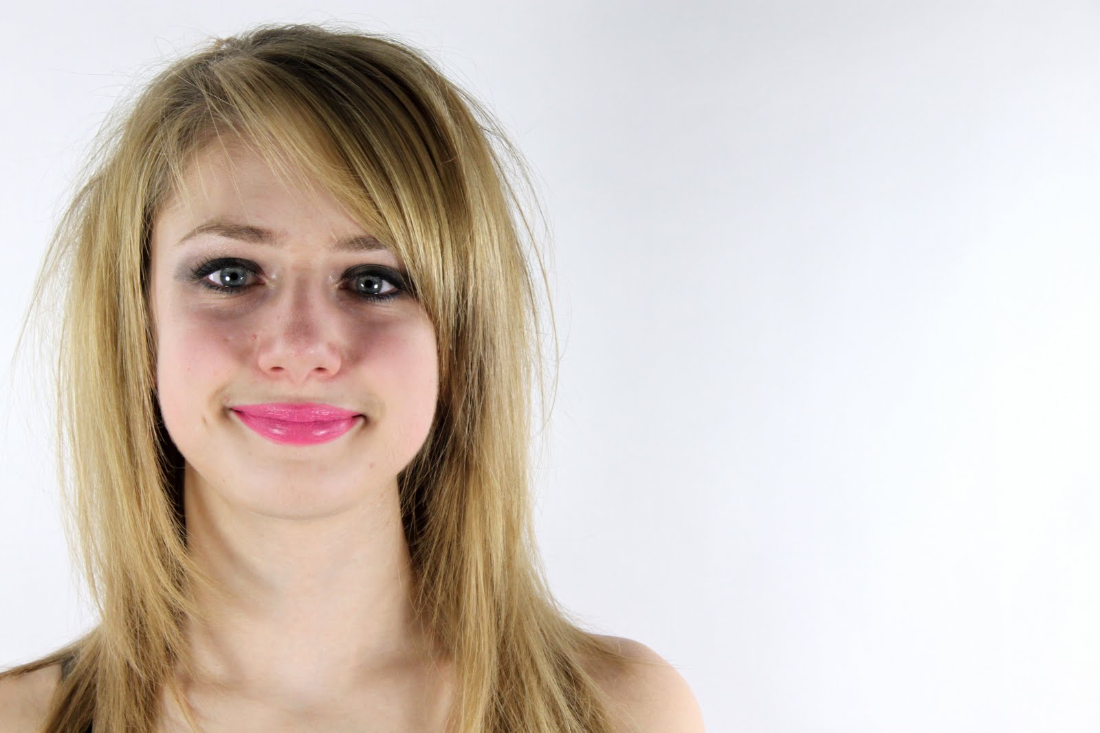
These are the first photographs I took in the studio and I am not so happy with these. For the first few frames I was experimenting with the lighting, I wanted to create an even balance of light so that the background was white and Abi looked: fresh, youthful and radiant. I dressed her in the essential costume which was just the sequin bra but this idea did not seem to come across strong on camera, instead it looked like a sleazy photo shoot which Abi does not look comfortable in.
I wanted Abi to feel: confident, strong but also desirable, this is not coming across in any these photographs! I couldn't work out what was making this photographs look rubbish so I decided that I would change several aspects such as: lighting, camera angle and costume. Once I did the photographs became stronger and seemed suitable for my digipak and advert.
The last photograph could be a possible photograph to put inside my digipak as it looks: fun, flirty and innocent which I believe suits my pop genre but I am certain that I will not use any of the others. Editing these photographs is not essential as I believe they seem perfect: composition, framing, lighting etc...

Thursday, 9 December 2010


Today I did my first photoshoot with Abi who is playing the lead singer; Tiffany Queen. I took photographs for both my digipak and advert in the photography studio using my digital SLR camera. Using the studio and and camera it has allowed me to create quality photographs.


Planning for the photo shoot helped me in the process, it saved times as I knew what I wanted but yet I still allowed myself to experiment with ideas.
I dressed Abi in several costumes I owned which I believe reflects a contemporary pop star; this included a sequin bra and genie trousers. I was inspired by artists appearances such as: Lady Ga Ga and Cheryl Cole, their style seems to be: performance, dramatic and individual. I have styled Abi to look individual and glam which creates a persona for our artist which many people decide if they want to buy their album or not based just on front cover. I also applied make up on Abi; lashings of mascara, smoky eyes and a vibrant pink lip gloss to add to the whole glam but attitude appearance we were trying to portray.
Abi took my instructions very well, I briefed her that I wanted her to portray beauty but also attitude. We did two costume changes in an hour and I believe I have captured the digipak front cover and also the advert photograph. I am happy with the photographs I have captured; it took a while to get the desired lighting but I believe I produced some quality photographs. I loved experimenting with this photo shoot, I changed: the backdrops, lighting, costumes, poses and angles to allow me to have a variety of photographs to choose from.